
I love learning new things and exploring how things work – this is largely what drew me to study physics in college. My interest in learning how things work is not limited to the physics, as I am very excited to explore new technology (including both hardware and software) and have a knack for envisioning how it could be used in my teaching. I love to tinker; taking things apart and figuring out how to rebuild them has always been exciting for me. This is very parallel to how I learn new technology – I play with it, exploring all the options and settings, and then contextualize it to determine what practical uses the technology offers, particularly in relation to my classroom. The following are examples of ideas I have had to enhance student learning through the application of new technological tools.
Artifact 1: Hyperdocs – A Virtual Field Trip
“Hyperdocs” are a digital method of fostering student exploration by connecting various resources for students to interact with into one central document via hyperlinks. Although I have only recently come across the term “hyperdoc”, I have been utilizing hyperlinks to organize classroom resources for quite some time. This practice eventually developed into a calendar model for my lesson planning, as highlighted in Artifact 1 on the Integrated Communication page of my portfolio. The onset of COVID-19 has inspired an accelerated adoption of new technology into my teaching. The following excerpt from my Week 2 discussion post in ETEC 524 provides the background for one of my efforts to utilize ‘hyperdoc’ technology in a creative way that I had not considered before.
“Towards the end of each school year, physics students in our high school have the opportunity to attend a ‘Physics Day’ at a local amusement park. Students make observations and collect data from several rides and have to apply what they have learned over the course of the year to analyze the rides. It is a fun activity, and one that students are excited about from the first day of class. With the onset of the pandemic and everyone going to remote learning models, going to the amusement park was not going to happen. This became obvious to my students in late April/early May, and unfortunately ‘Physics Day’ became “one more thing that was lost to COVID.
I decided to try to create a virtual field trip to the amusement park by making a collection of videos people had loaded on YouTube. I had a lot of fun putting this together, and what began as a Google Doc with hyperlinks quickly evolved through multiple modes until I landed on making a Google Site, complete with a Park Map, Google Street View of the park, and ‘between the tracks’ views for some rides. I had a lot of fun with the project, and although it was not the same experience of actually taking the rides, students seemed to appreciate the effort.”
-Week 2 Discussion Post, ETEC 524
Lake Compounce is the oldest continuously operating amusement park in the US and is home to Wildcat, one of the oldest roller coasters in the US to still be operating at its original location. Enjoy your own virtual roller coaster ride today!
After I shared this project with colleagues, a member of the special education department asked me to help her design a virtual field trip to local stores for students who would typically do site visits as part of her program. This opened my eyes to the true academic impact that hyperdocs can have for a student – a student who was unable to go into stores due to health concerns in the pandemic was able to practice locating and identifying items on the shelves of his favorite stores. While the videos could have been accessed through YouTube, the hyperdoc allowed him to make choices about which store he would ‘visit’ without the overwhelming task of sifting through countless posted YouTube videos.
Although I have not yet unleashed my new appreciation for hyperdocs into my standard classroom instruction, I am brainstorming how hyperdocs can transform student learning. I am considering asking students to record footage of physics phenomena that they observe in their daily life, and connecting all incoming results to a centralized hyperdoc. This would allow all students to interact with the observations made by their peers and collaborate to develop technical explanations of what they have seen using specific physics concepts and vocabulary. This would transform student learning, as the students would be searching to make connections between physics principles and the real world, rather than relying on the teacher to provide examples. As I reflected in my Week 2 discussion post, the affordance of this hyperdoc scavenger hunt is that students are “already recording what they do and where they go for sharing on social media, I would just be encouraging them to maintain what is becoming familiar practice while thinking about what they are looking through a science lens.”
Artifact 2: Exploration of Student Blogging Options & Other ETEC Tools
In the first week of ETEC 524, I explored various blogging platforms to determine which options would work well for student led blogs. I concluded that integrating a Google-based Blogger.com would be the most likely candidate as I teach in a Google District. I already have some experience using Google products, so I decided to take advantage of the opportunity to learn something new and developed my own blog and portfolio using wordpress.com. While I am happy with my final product, I find that the more I play with the design of this site, the more customization options I wish I had access to. WordPress.com does provide a variety of customization options, but they are available in a tiered model, with more tools available at a higher price point. This would be a limiting factor if I were to try to implement blogging or web design through WordPress.com in the classroom. There is also a steeper learning curve to wordpress.com than I initially realized. As my portfolio was nearing completion, I decided to play with some of the different customization themes, but discovered after applying a few that large bodies of content had been deleted in the process, and there was no way that I could find to recover the few hours of work that had been lost. I would see many high school students not being willing to start again if experiencing a loss like that. With the greater level of customization comes the cost of getting familiar with more tools, which would eat up more classroom instructional time than I could easily invest in my classes.
I encourage you to explore my blog, which includes reflections on several areas of “Tech Play”, including tools to develop Informational Literacy in science classes, Creativity Tools, and ePortfolios. Reflections on student blogging tools can be found in my first blog entry entitled “It All Starts Here“.
Artifact 3: Student Generated HR Diagrams
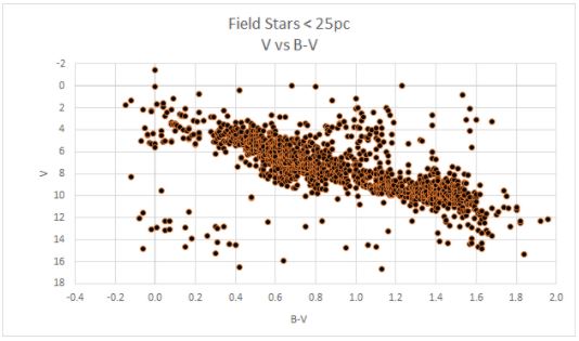
One of the exercises I completed for “Introduction to Astronomy & Astrophysics” (PHYS 561) was to develop a series of HR diagrams using catalogs of various star groupings. A Hertzsprung–Russell (HR) diagram, is a scatterplot of stars that shows the relationship between the stars’ absolute magnitudes (or luminosities) versus their color (or effective temperatures or classifications). This is one of the most useful techniques for observing relationships between characteristics of stars, as the diagram for large data sets demonstrates a very compelling trend between the ‘brightness’ and ‘temperature’ of stars.
In this project, I analyzed data from three star clusters (stars in a cluster are the same approximate distance from Earth and relatively “close to” one another, so it can be assumed those stars formed at the same time and are approximately the same age). I also analyzed data from all ‘field stars’ that are within a 25 parsec radius of the Sun, accounting for roughly 1300 stars. Although these stars are all closer than those in the the clusters, they are individually at different distances, and therefore I had to make a correction for each star’s distance independently.
For each data set, I first created an “Apparent Magnitude vs B-V” graph, where apparent magnitude (V) corresponds to the relative brightness of a star in the visible spectrum, and B-V corresponds to the color of a star.
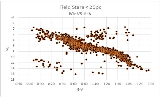
I then corrected the apparent magnitude for distance create an “Absolute Magnitude vs B-V” graph, where absolute magnitude corresponds to the brightness that a star would have if it were moved to exactly 10 pc from Earth. This allows us to make an authentic comparison between stars, as stars that are bright but far away may actually appear to be fainter than closer but dimmer stars as viewed from Earth. This correction removes the bias of our point of observation.
The color of a star corresponds to the surface temperature of the star, analogous to how a blue flame is a higher temperature than a red flame. From the absolute magnitude of the stars, the effective luminosity can be calculated, correcting to include light from the entire electromagnetic spectrum (up to this point we have only been accounting for visible light when measuring magnitude). The result is a plot of log(L/Lsun) vs log(T), where L is the luminosity of the star, Lsun is the luminosity of the Sun, and T is surface temperature of the star.

The final stage was to relate this directly to luminosity (recorded in proportion to the luminosity of the Sun) and surface temperature. As stars can be classified by surface temperature, this process allows a comparison between the stars included in this study and an existing system of classification, which groups stars into O,B,A,F,G,K, and M type stars.

It is noteworthy that at each stage in the process, the general shape of the plot is similar, although the data appears to be more tightly correlated in later graphs. By comparing plots of the various data sets, it is also possible to see that stars, regardless of their location in the night sky, fall into the same pattern of relationship between luminosity and temperature.
While I completed this activity as an assignment in my graduate coursework, I plan to implement a scaffolded version of the project into an astronomy elective course that I teach. Student-generated HR diagrams will provide a much greater appreciation for the significance of the plot and relationship between the aforementioned variables than simply providing a published copy and asking students to interpret it. I did complete this project using Microsoft Excel, which would not be available for my students who work primarily on Chromebooks. To implement this project in my class, I would need to develop a method using Google Sheets so that all students have access.
I have considered a few possible scaffolding methods to make this project more approachable. One option would be to provide students with a copy of a Google Sheet with all formulas entered, leaving blank columns for them to import raw data. This would allow students to choose any star clusters with data available (there are many possible options) and see that similar trends occur regardless of the cluster selected. Another option would be to provide students with each type of graph for several different clusters and allow them to make observations and identify similarities/trends. The latter option would be preferable for students who would have difficulty navigating large data sets, but I think many of the students in that course would appreciate the process of creating their own diagrams using real data. As is illustrated in my completed scatterplot collection below, the Hyades Cluster includes mostly ‘moderate temperature’ stars (F-G), whereas the NGC 3532 Cluster (the Wishing Well Cluster) contains a larger number of hotter stars (A-F). Despite this difference, all groups follow the same general trend of hotter bright stars on the top left of the plot down to the dimmer cooler stars on the bottom right. My hope is that even without the “full version” of the HR diagram, students could predict that relationship given the groupings of stars in multiple clusters.
You may view the entire collection of graphs for comparison in the document below – O and B are not labelled on these charts as those star classifications were not represented in the data sets I selected, and they are so much hotter than other stars it would dramatically compress the graph to include them.
